- What's brewing in AI
- Posts
- 🧙🏼 Show me the architecture
Show me the architecture
Stop building blindfolded with AI—visualise what you're creating

Was this email forwarded to you? Sign up here.
PS. I’ve got few remaining slots for paid 1-on-1 sessions. If you're stuck or overwhelmed with AI, we can work through your specific challenges together. Only available this and next week. Details here | Book your session.

Co-creating something with AI—whether that’s LLM-assisted coding, creating dashboards, automating processes, whathaveyous—can quickly get messy and complex.
I've found myself increasingly using a technique to help understand what I'm actually creating. It involves asking the AI to visualise the processes and relationships of what I'm building. It enables me to build more advanced systems because it’s no longer just pieces of code and text—it’s a visual map.
I call it "show me the architecture".
The problem: prompting in the dark
When you lose track or lack understanding of what you’re creating with AI, you’re building blindfolded.
Not a good idea, but it happens to everyone.
The best way to ensure that what you build with AI works as you intended is to have a clear understanding of what you want to built, a detailed plan of what needs to be created, and to build iteratively.
But as you may have experienced—AI still has a tendency to make assumptions, create unnecessary complexity and over-engineer. And if you're coming from a mostly non-technical background like I do, it's easy to lose track over what has actually been created.
The solution: visualising complexity
Even Andrej Karpathy (ex director of AI at Tesla and OpenAI founding member) admits to getting lost in AI-generated complexity, and finding visualisation to be a good strategy. Here’s part of a longer tweet he recently posted:

I'll show you two approaches that have transformed how I build.
IN PARTNERSHIP WITH SHUTTERSTOCK
Better inputs. Sharper outputs. Download the guide to premium AI.

Building or refining generative AI models? This guide shows why scraped data falls short—and what to use instead. Learn how real-world behavior signals, clustering, semantic scoring, and visual diversity improve output. Plus, see how Shutterstock’s licensed data and services reduce risk and boost performance. Train smarter, faster, and more responsibly.
Here are two recent examples of how I’ve used the "show me the architecture" approach to avoid flying blind.
Example 1: Creating a Google Sheet dashboard
I wanted to build a reporting solution for my different sponsorships in Google Sheets (shoutout to my sponsors who help me keep this newsletter free). The purpose was to have a better overview of upcoming sponsors and a unified system to track ad performance.
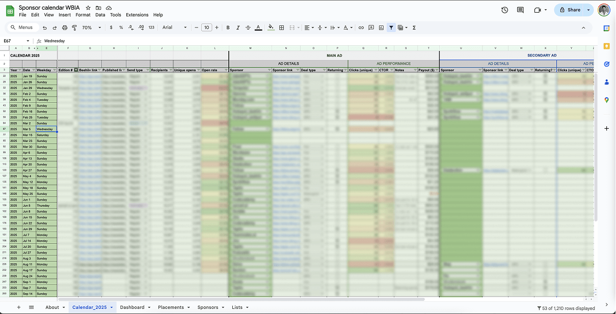
To track upcoming sponsorships and historic performance, ChatGPT helped me implement this calendar view. I’m now using it almost daily.
ChatGPT helped me create a calendar that tracks all the newsletter editions: dates, editions, sponsor placements, rates, performance metrics. It suggested the specific columns I needed and provided ready-to-paste formulas; this worked really well.
After the tracking was set up, I wanted a dashboard with KPIs and pivot tables pulling data from the tracking sheet. Here’s where the complexity started to confuse me: ChatGPT suggested an obscene amount of named ranges, conditional formats, filters, pivot tables and array formulas.
At this point, I found it helpful to ask it to create an ASCII visualisation of the dashboard layout. This took literally 20 seconds and let me see exactly how the metrics should be organised spatially—the revenue snapshot, rolling windows, column orders, etc. It made the abstract concrete.

After Chat helped me implement the ad performance tracking, I asked it to create a tab with at-a-glance KPIs. To understand what it was recommending, I prompted “create an ASCII visualisation of the dashboard layout you’re recommending”
I immediately understood what its suggestion, spotted metrics I didn't need, a few I wanted to add, labels that were too complex, and other tweaks I wanted to make.
The visualisation itself didn't build anything, but it gave me a mental model about what ChatGPT was suggesting that I could easily evaluate and refine.
Example 2. Building an internal tool
When vibe coding I find myself in a perpetual state of not fully understanding what I’ve build, nor why it’s not working like I want. It’s hard to understand the latter without a firm grip on the former. This is where I’ve found visualising the complexity to be extremely helpful. Here’s an example.
I’m building an internal tool that automates the process of adding new case studies from credible sources to my site contextwindows.ai (I’m excited to share an update on this with you soon).
VISUALISING SYSTEM ARCHITECTURE
This internal tool needed to do a host of things. Monitor web sources, run checks against a database, extract content, process it with AI, turn it into structured data, flag for human review, push everything from DB→CMS→frontend.
I asked Claude Code to map the system architecture for me with an intuitive visualisation; colour-coded lanes for different processes, helpful icons, direct links to different parts of the system, and additional information when I hover over each box.
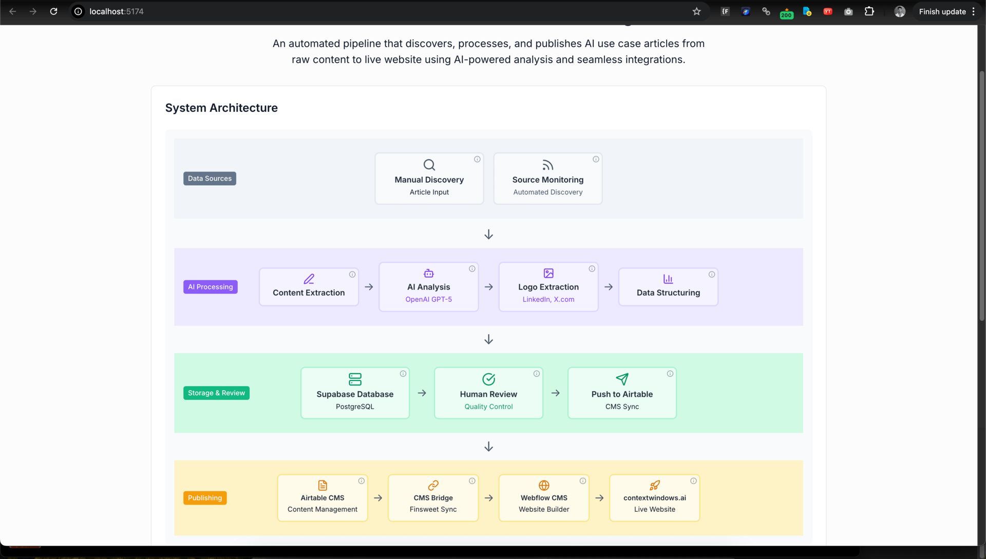
It took a few prompts and about 20 mins to get this result, but the map truly helps me steer the course as I develop the tool
VISUALISING PROCESS FLOWS
A key part of the automation I’m building involves monitoring specific web sources and checking for new case studies to add to the database. There’s challenges related to accessing the URLs programmatically, dealing with redirects, fetching publishing dates and checking against my existing database to avoid duplication of items.
I kept facing troubles getting the scraping process to work with Claude Code. This felt difficult to solve because I didn’t fully understand the sequence of things happening in the process, nor was I able to see the system working through the different processes. So I asked CC to add a step-level preview that allowed me to see the process in real-time and expose exactly where the issues happen. Console logs are the traditional way developers debug things like these, and they’re helpful, but for someone like me I like to have things out in the open where I can see them at all times, with clear visual cues to help my mind make sense of it.
Visualising process flows directly in the user interface is also an amazing hack if you’re building a tool that will be used by others on your team or clients (especially non-techies). It’s no longer just debugging, but an important feature of your app; anyone can quickly understand how processes work.

The approach is useful enough that I’ve built similar process flow visualisations into all key parts of my tool. Another example is how I visualize the sync process to my CMS:

I start off visualising a flow with prompts such as “make the process flow visual in the UI”, then refine the result over a few prompts to get exactly what I want
The only way for me to succeed in building something like this is understanding how things are connected. I don’t need to understand every single piece of code to make something useful—but I need to know how the processes work together.
When I return to this tool weeks later, I can instantly see what's happening. Beautiful, isn’t it?
Escaping the black box
Being able to get AI to “show you the architecture” in different ways is an essential yet underused skill for collaborating effectively with it.
The next time you’re in the trenches co-creating something with AI and it’s getting complex, stop. Ask AI to make the invisible visible.
It will help you understand and navigate what you’re creating.

THAT’S ALL FOR THIS WEEK
Oh, here’s a rock I saw at Oslo’s botanical garden yesterday. Millions of years to make this wavy pattern. Amazing, isn’t it? |  |
 | Was this email forwarded to you? Sign up here. Want to get in front of 20,000 AI enthusiasts? Work with me. This newsletter is written & shipped by Dario Chincha. |
Affiliate disclosure: To cover the cost of my email software and the time I spend writing this newsletter, I sometimes link to products and other newsletters. Please assume these are affiliate links. If you choose to subscribe to a newsletter or buy a product through any of my links then THANK YOU – it will make it possible for me to continue to do this.